
Reinventing the Wheel: Why I Built a New VFR Navigation Log Format
Intro
How do I actually teach XC planning well?
- That question came up while I was putting together CFI teaching material, and I kept circling back to it.
- I ended up recalling every painful, confusing moment I’d had with navlogs through my PPL, IR, and CPL, and built something out of that.
- Here’s what I built, followed by the thought process behind it.
The New VFR Navigation Log Format I Built
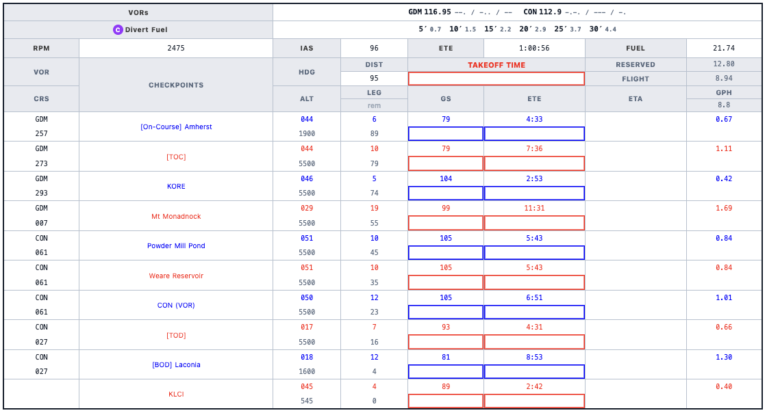
YB NAVLOG will give you THIS
1. A Navlog for Flying, Not for Calculating
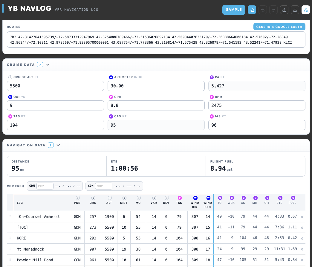
- I thought the navlog formats available online were inefficient. But I also didn’t want to rely on an auto-generated navlog whose numbers I couldn’t justify.
- So, based on my own experience, I built a navlog format I consider efficient.
(Below) I stripped out the values that only exist to support the calculation, keeping only what’s actually needed in flight. Everything from the calculation process is still there — it’s all included once you print the PDF. Each leg is color-coded so it’s hard to lose your place, and the VOR morse code is generated automatically (you still enter the frequency yourself).
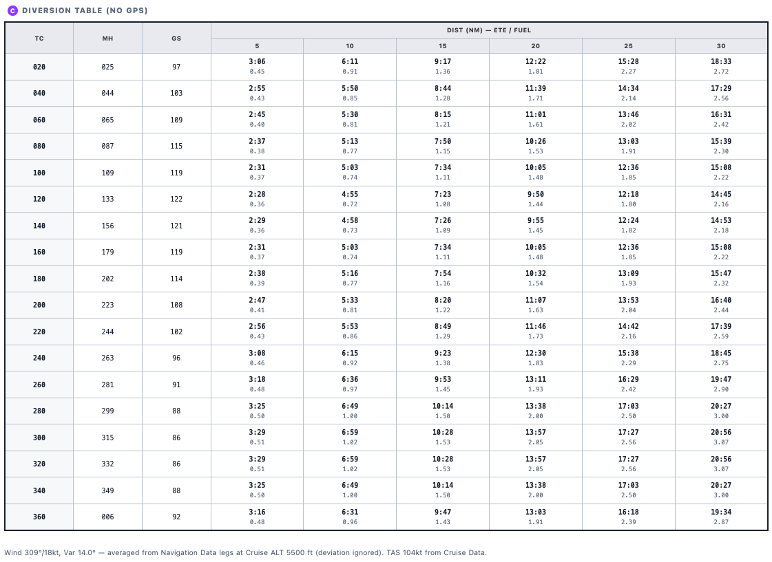
(Below) It also covers a divert scenario without GPS. Since your cruise altitude, TAS, and winds aloft are already known at planning time, this pre-builds a True Course / Distance Lookup Table for the divert scenario.
2. Visualizing the Relationships
A relationship diagram lets you grasp the big picture first.
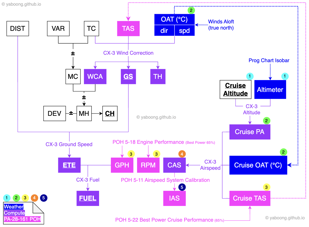
You can pull this up any time by clicking the Field Relationship Diagram button in the YB NAVLOG header.
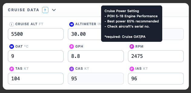
As you fill in values in order, the tooltip next to each input tells you where to find that value and how to use it.
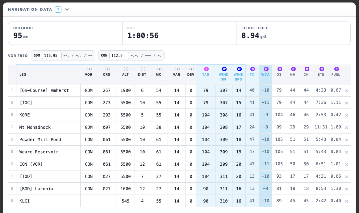
Hovering over one of the calculated values in the navigation data table shows exactly which inputs feed into it. (Hover over the WCA column and TAS, Wind dir/spd, and TC light up — meaning WCA is derived from TAS, Wind dir/spd, and TC. The same works for every other column.)
3. Using Google Earth
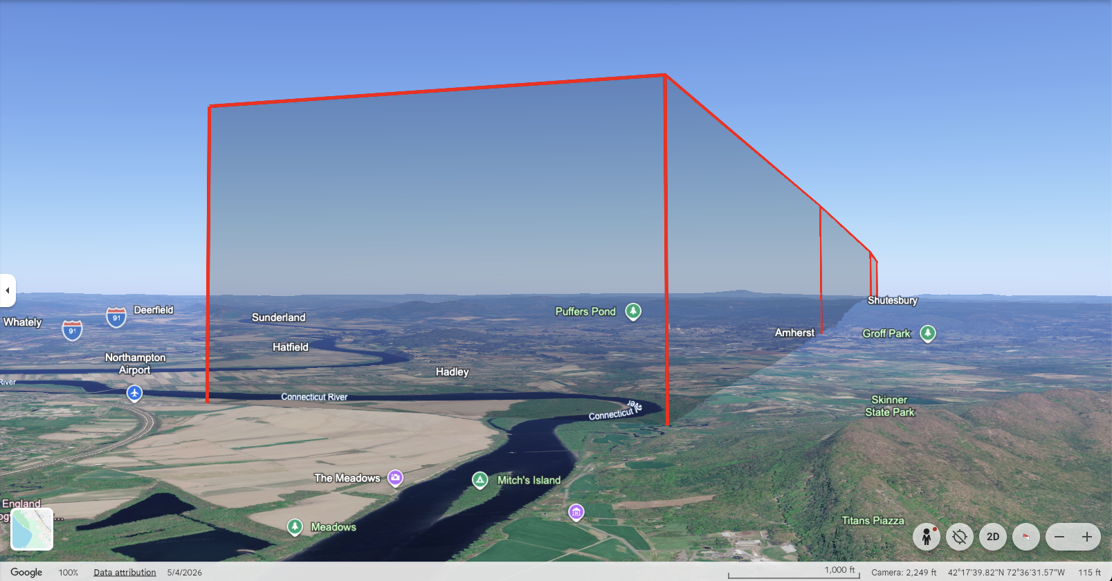
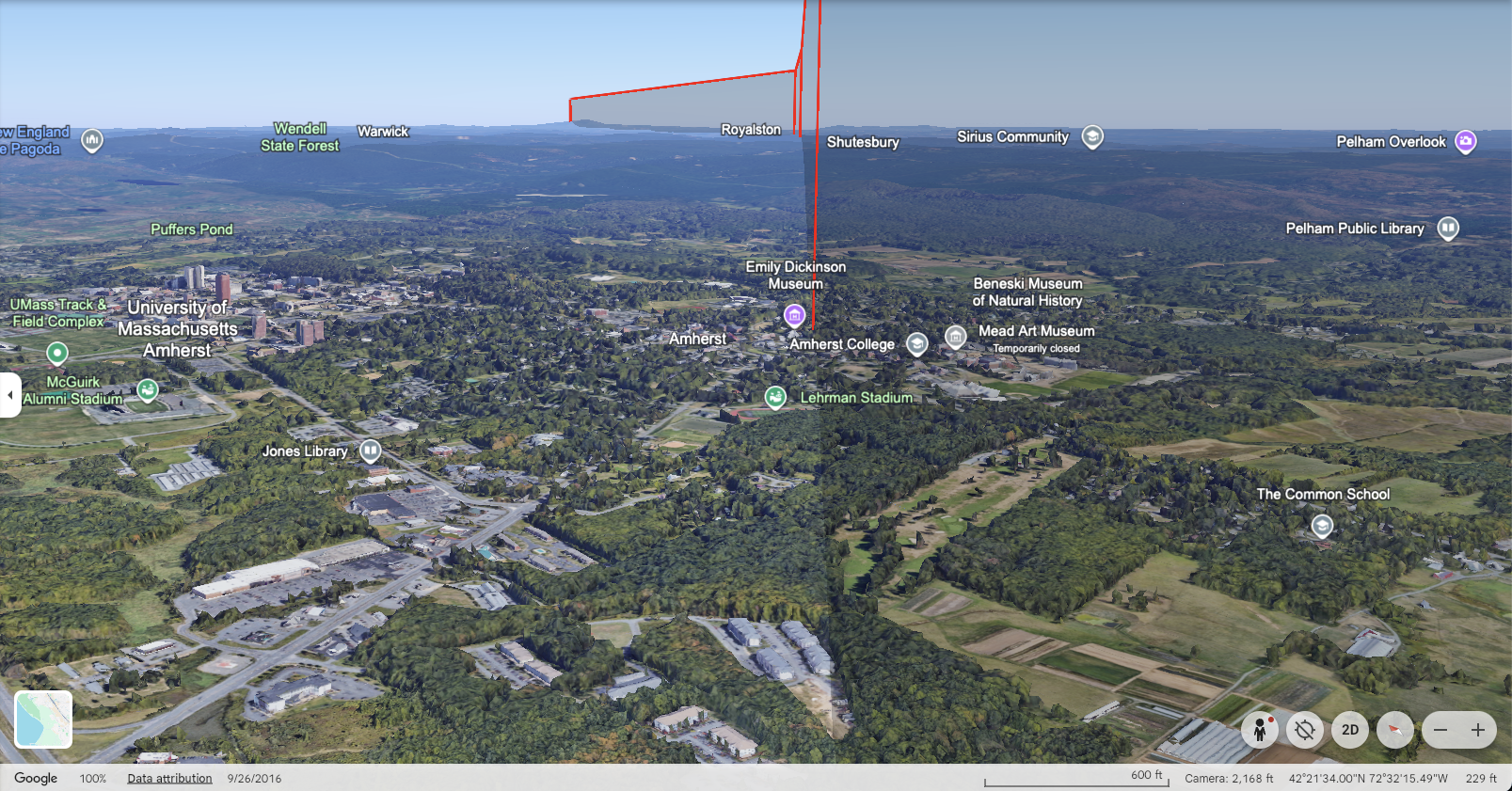
You can download a file that lets you open your planned route in Google Earth. It’s not a replacement for the VFR Sectional Chart — the point is to cross-reference the two: read the chart as usual, then check what that same spot actually looks like in Google Earth’s 3D terrain view, which makes picking good checkpoints much more effective.
Comparing the two catches mistakes you’d otherwise make from the chart alone — a feature that looks like a big pond on the chart but is actually hidden behind a mountain along your flight path, a “ski area” label that’s actually on the far side of the ridge from your route, or an airport you assumed would be easy to spot but turns out to be hard to identify in practice.
One caveat: prominent man-made features like wind turbines don’t always render well in Google Earth, so keep cross-checking against the chart.
How to Use YB NAVLOG
Hate reading instructions? Just hit the SAMPLE button at the top to see how it looks, clear it with the eraser, and fill out the fields as they come up.
Start by reading the User Guide section.
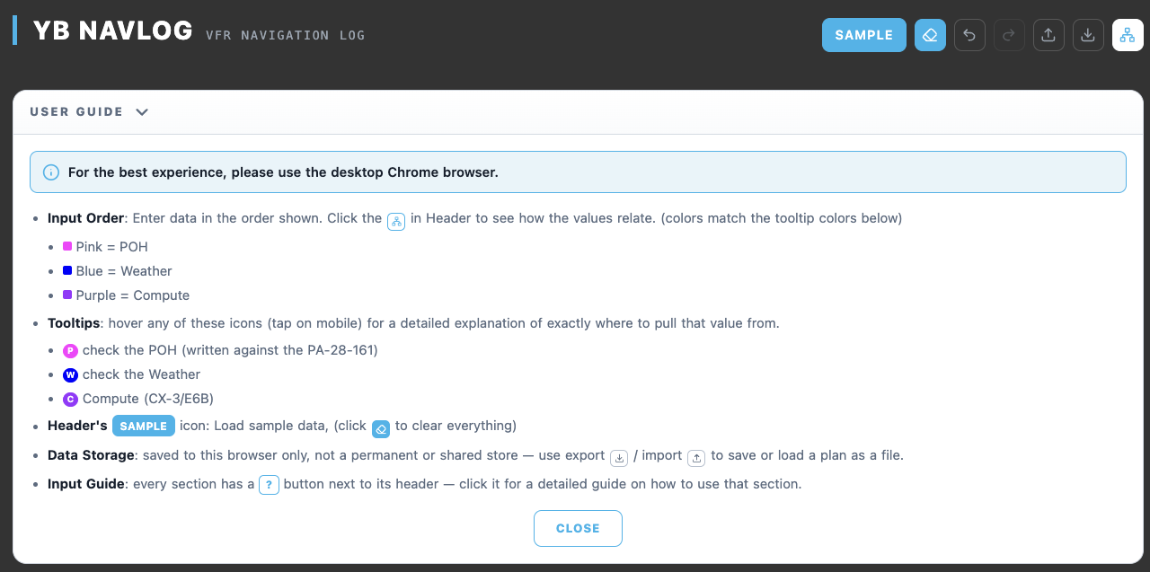
Every section header has a ‘?’ icon — click it for a detailed explanation of how to fill in that section.
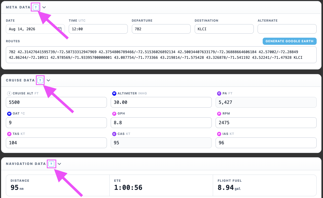
If you’d rather skip reading, you can just fill in the inputs in the order they appear.
Once everything is filled in, hit PRINT / DOWNLOAD PDF at the bottom to generate the PDF.
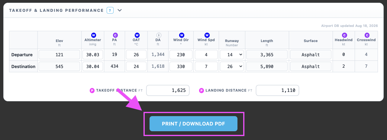
And you will get THIS
Bring it along with your weather briefing to the checkride!
Yes, I Reinvented the Wheel. WHY?
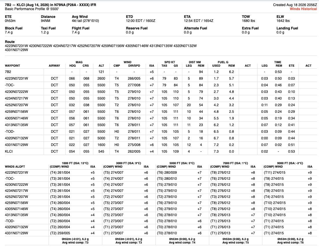
- The ForeFlight navlog is unbeatable on efficiency. It’s fast, it recalculates instantly, and there’s zero human error (no arithmetic mistakes).
- In real-world flying, nobody solves the wind triangle by hand every leg. That’s exactly why plenty of people say it’s fine to use for a checkride too. (Just make sure you know your examiner’s style ahead of time and decide accordingly.)
- But I couldn’t bring myself to use it on a checkride.
- The reason is that it’s hard to reason about how each number was derived. It’s difficult to justify any single value, because I didn’t build it and I didn’t calculate it.
- An auto-generated navlog is a great tool, but if you can’t reason about the numbers behind it, that’s risky while you’re still learning.
- So I wanted a happy medium: something where I could still explain every number, without having to do all the math by hand.
1. The Navlog Formats Out There Didn’t Fit Me
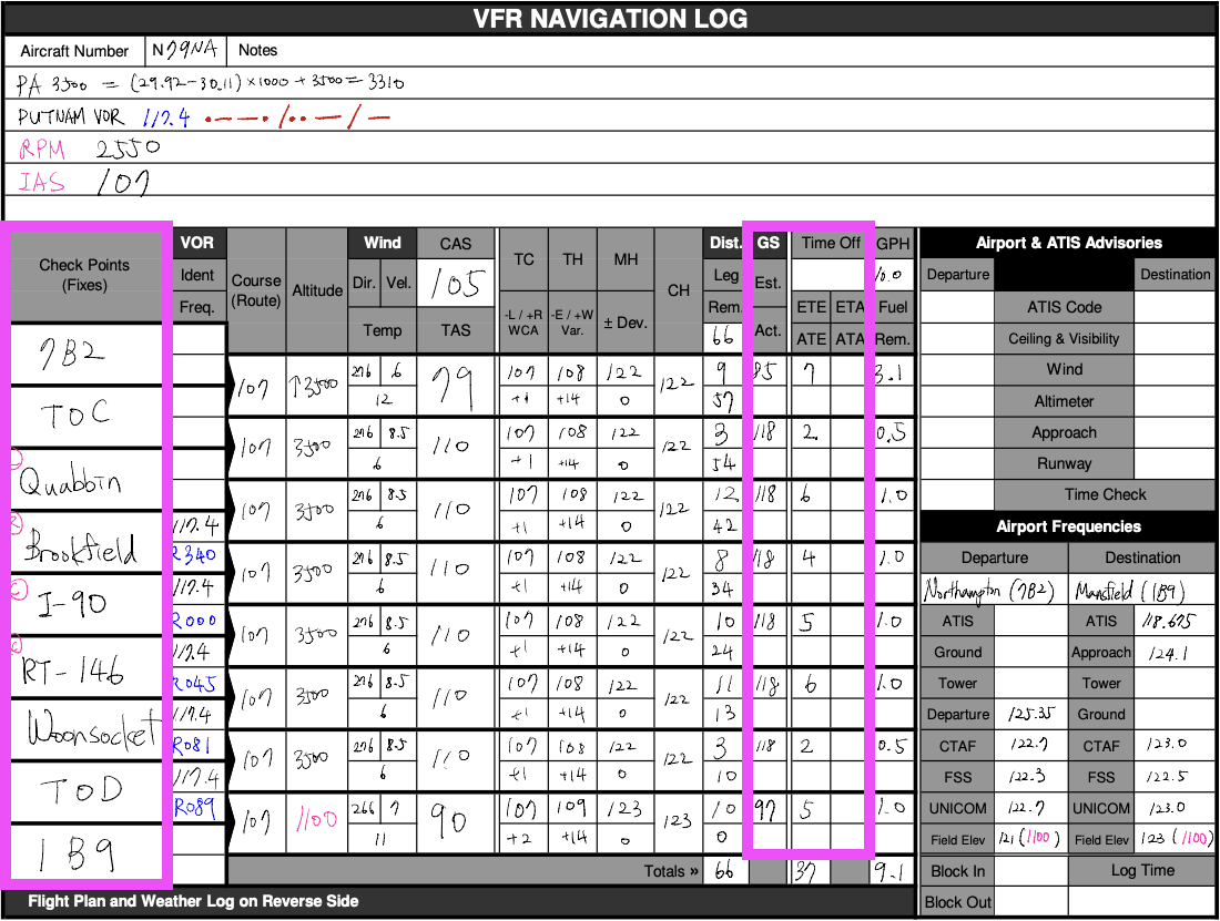
- The format I used to use is the one you can get here.
- The problem with this form is that it bundles in every value needed for the calculation process, even the ones you’ll never actually need in flight.
- That makes it confusing when you’re trying to fill in GS and ETE mid-flight. The checkpoint name sits all the way on the left, and the values you need to fill in sit all the way on the right.
2. I Wanted to Minimize Checkride-Eve Stress
- To pull that off, I needed a more efficient, automated tool — but one I could still explain.
- The night before a checkride, you have to pull the latest weather briefing and do your XC planning from scratch, so a big chunk of that evening ends up going to XC planning.
- But by the time you’re actually at your checkride, you already understand how XC planning works (you have to, at that point). So if I could fill out the navlog more efficiently, that frees up time for the things that actually matter more — double-checking POH numbers, making sure I haven’t missed anything, and just settling my nerves.
3. My First Navlog Was Utter Chaos
- I didn’t even know where to start. Here’s roughly the stream of consciousness I went through back when I wasn’t used to navlogs:
- Okay, I guess I start with the TC. Then what — do I open the POH next? Or do I need to do W&B first?
- Wait, to read the POH charts I need pressure altitude, which means I need an altimeter setting — but how am I supposed to know tomorrow’s altimeter setting the night before the flight? Most TAFs don’t even include an altimeter setting… Can I just use the pressure reading from an iPhone app? Windy? I’ve heard that data is decent too… KCEF has an altimeter setting, but is that reliable? The iPhone one or Windy might be better… but I should really use an official source, so let’s go with that. Except there’s no TAF near the destination with an altimeter setting either… ugh, whatever, it’s all a forecast anyway and it’ll change, so let’s just use something.
- Okay, takeoff first — let’s calculate takeoff distance. Oh wait, I need headwind for that. And weight too, apparently.
- Let’s do weight & balance first, then. Oh, that needs fuel figured out first.
- To calculate fuel I need ETE and distance per leg, so I’m back to the legs again.
- Alright, legs. Put in course, then I need TAS, so let’s open the POH.
- Wait, why are there two charts — it’s different by serial number? Where’s the right one even located?
- Oh, to read TAS I need OAT (outside air temperature) — that’s why the TAS chart has wind and temperature columns on the left…
- And to read the TAS graph I first need to settle on a power setting — which means yet another chart…
- It went on and on like that. Completely disorienting and chaotic.
- Right before a checkride, when you’re drilling it constantly, you get used to it. But once time passes, you forget, and the confusion just repeats itself.
4. Changing a Value? Oh No.
- Even once you’re used to it, revising your route or your plan is overwhelming, because so many downstream values get affected in a chain reaction.
- What if you forgot to “subtract 7kts if wheel fairings are not installed” when calculating TAS?
- What if you wake up and the winds aloft forecast has shifted significantly overnight?
- In both cases, you have to redo WCA, GS, ETE, and fuel for every single leg, and redo W&B on top of that.
- If you’re lucky, you at least remember which parts need recalculating and what’s affected. But often you can’t even trace which values are related to which, so predicting what else changes when one value does is even harder.
5. Could the Relationships Between Values Be Easier to See?
- I wanted to be able to see the relationships between all the values used while filling out a navlog.
- The reason a navlog feels so confusing is that it’s unclear where a given value comes from, or how the values relate to each other.
- Some values need to be looked up in the POH — but which chart, and what feeds into what, is genuinely hard to trace.
- I wanted some way, even a small one, to visualize which values depend on which, and what affects what.
6. What About Diverting?
- Diverting looks different depending on whether GPS is available or not.
- Every examiner I flew with let me use GPS once we got into a divert scenario, which meant all I had to do was read ETE off the avionics and calculate fuel. (Rather than calculating on the spot, I’d pre-built a lookup table and brought it with me.)
- But depending on the examiner, you might be asked to divert without GPS too, so you need to be ready for that. I wanted a way to prep that in advance during the planning stage, with as much of the calculation automated as possible.
7. I Wanted to Pick Good Checkpoints
- This is a slightly different problem from the navlog itself — the navlog is about doing dead reckoning accurately, while picking good checkpoints is about doing pilotage well.
- This takes time.
- This is where I lean on Google Earth.
- I can take the GPS coordinates I laid out in ForeFlight or SkyVector and open them in Google Earth, and I wanted to automate generating the file that lets me do that.
Best of Luck!
Save time, keep the reasoning, sleep tight!
Disclaimer
⚠️ This is for educational purposes only. I am not a certified flight instructor (CFI). Do not use this as a substitute for professional flight training. Always consult a CFI and follow your aircraft’s POH. I accept no liability for any actions taken based on this content.

